
Yesterdays post about the Before + After Boys Bedroom proved quite challenging for a new blogger like me. I can't figure out how to make my images be neatly lined side by side...Before photos on the left side and After photos on the right. And something happened that won't allow the images to get larger when clicked on. So today I'm going to install one image at a time. Blogging is similar to learning how to drive; and I'm not ready to parallel park yet, that's for sure.
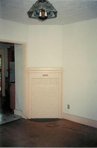
This is another room I did for the St. Margaret's Hospital Guild Decorator Show House in 2001. (This yearly event is held in Indianapolis which gives interior designers an opportunity to showcase their skills and the proceeds go to Wishard Hospital. Very worthwhile in every way). Now this tiny dining room was in an almost abandaned cottage (it had a few critters that had taken up residence...eewww!) behind the main mansion. It was a daunting task, working through the winter without heat, and a huge hike to the nearest restroom after drinking too much coffee to stay warm. The floor under the bad, bad (double eewww!) carpet was "spongey" and had to be replaced. The boarded up window in the "before" photo with the air conditioner became known as The Mystery Window. We found the window in the basement, but it was just the frame and in many pieces. Then the window pieces vanished for months. Poof. The mystery of the missing window was resolved, repaired, assembled and put in place almost as the show opened it's doors to the public.

The walls were old plaster and required much attention. I was determined to apply vertical stripes to visually raise this less than 8' high ceiling. None of the walls were straight. My husband and I measured and remeasured a bazillion times and finally tricked the eye by slightly changing the size of each stripe, and in the end it was Perfecto Mundo. We did the stripes ourselves, since these show houses become quite expensive undertakings. The tiny fireplace was deemed unsafe so I left it closed up, and instead, put wrought iron over the front of the brick to provide interest. The light fixture was actually brittle plastic and came apart with unexpected ease.

 I reupholstered these Parsons chairs in a cotton stripe and had the wreath and bee imprinted on the inside backs. I brought these chairs back to my studio after the show and we use them to this day, albiet they have shown some wear since their hayday. I loved the backs of the chairs which have a long pleat held shut by a button with the bee imprint. Keep in mind, this was 2001 when the country french/bee was hot, hot, hot. The venue for the show houses I participated in were centered around historical preservation. Bringing a home back to life; to it's former glory.


I don't know how to show the inside of magazines and books in a creative way. As I learn more I might come back and redo a couple things. If anyone reads this and feels sorry for me, I'd love to get some technical pointers. In the meantime, I hope you enjoyed this flashback Before and After as much as I've enjoyed pulling up old photos and memories. This is actually kind of fun.

 I reupholstered these Parsons chairs in a cotton stripe and had the wreath and bee imprinted on the inside backs. I brought these chairs back to my studio after the show and we use them to this day, albiet they have shown some wear since their hayday. I loved the backs of the chairs which have a long pleat held shut by a button with the bee imprint. Keep in mind, this was 2001 when the country french/bee was hot, hot, hot. The venue for the show houses I participated in were centered around historical preservation. Bringing a home back to life; to it's former glory.
My efforts paid off. This room won me a First Place Key Award; and a First Place ASID Award (American Society of Interior Designers) and a huge amount of press. Here are a couple magazines below. I'll have to dig around later to see which other magazines carried the story (I'm writing this on the road). The best experience, by far, was having the front cover of Better Homes and Gardens Window and Wall feature my little design. The editor flew in and came to my place to hand deliver a copy. Surely she had other business in Indianapolis, but did make an effort to let me know the front cover WAS a big deal. I can't even remember her name now, but I remember how warm and gracious she was toward me and my work.


I don't know how to show the inside of magazines and books in a creative way. As I learn more I might come back and redo a couple things. If anyone reads this and feels sorry for me, I'd love to get some technical pointers. In the meantime, I hope you enjoyed this flashback Before and After as much as I've enjoyed pulling up old photos and memories. This is actually kind of fun.

so i still have the issue of W&W and LOVE what you did with the dining room!
ReplyDeleteHi Paula!
ReplyDeleteYou know how much I loved this room!
It was so much fun "meeting" you and getting to know the lady behind the inspiration.
Donna
I remember this photo too, and I was very inspired by it too, it is such a happy room! I am glad that you received such good press for this, you deserve it.
ReplyDelete